Think a brand’s visual identity is just about looking good? It’s not. It shapes how people see you: your professionalism, your reliability, and what you offer. Running a startup? A creative agency? A consulting firm? Then you already know your logo and colors make a first impression – sometimes before you even speak. But does your visual identity match what your clients expect? That’s a detail many overlook. Strong branding balances functionality and aesthetics. Here’s how to align your visual identity with client expectations – and present your brand as clear, credible, and built for them.
Know Your Audience First
Before you design anything, you need to know who you’re trying to reach. What do your ideal clients prefer? What visuals are normal in their industry?
Some clients like minimal, modern designs. Others expect something more traditional. For example, people in finance might trust clean lines and neutral colors, while a tech audience may prefer something sharper and more modern.
Start by doing a bit of research:
- Look at your existing clients. What design trends are common where they work?
- Study competitors. How do they present themselves? What’s working for them?
- Ask questions. Get direct feedback on what your clients like and why.
This kind of information helps you make choices that actually match client expectations. Be honest in your design. The way you present your business should match reality. It will show clients you’re serious about how you work and that you value clear communication. Furthermore, it also ties into the larger role of ethics in digital marketing. You have to avoid using visuals that mislead or overpromise. Instead, clients notice when your branding aligns with your actual services, and they value transparency and consistency.
Why Consistency Matters
Inconsistent design causes problems. It can confuse people. It can also make you look disorganized. If your website, social media, and presentations don’t look anything alike, clients may think your attention to detail is lacking. That’s something you want to avoid.
To fix this, put clear rules in place. Set brand guidelines. Define your colors, fonts, and how to use your logo. Then check all your materials and update anything that doesn’t follow the rules. Also, consider using templates. It makes things easier and helps keep everything aligned.
Match Your Visuals to Your Services
Does your brand’s visual identity reflect how you work? If you aim to be approachable but your branding feels cold or rigid, that’s a disconnect. Or if you focus on technical services but your visuals feel casual, the message gets blurred. Your design should match both your audience and your offering. It should give clients a sense of what working with you feels like.
Keep Things Clear
Sometimes, design can go too far. In trying to stand out, many businesses create visuals that are hard to read or navigate. But clients prefer clarity. They want to find what they need quickly. They want to read your content without straining their eyes.
Here are a few things to check:
- Use simple, readable fonts. Avoid decorative type for important text.
- Check contrast. Make sure everything is easy to see, even on different screens.
- Keep navigation straightforward. Menus and layouts should be easy to follow.
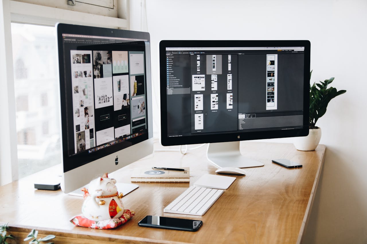
Use Relevant Images
Photos and graphics should reflect your client’s world. The materials you use don’t need to be generic, but they should make sense. If your clients work in corporate settings, don’t use casual lifestyle images. Choose visuals that reflect their environment. This is the best way to align your visual identity with client expectations.

Images also need to support the message on the page. A polished layout means nothing if the visuals distract from the content. Use photos that speak to the topic without feeling staged. Avoid stock images that look overly posed or are irrelevant to the page content. You should choose images that show real settings, real work, or real people your audience can relate to instead.
Keep lighting and color consistent across your site. This creates a sense of visual unity – the viewers will be able to navigate the website more easily. When in doubt, test different visuals with users or team members. A quick check often reveals what feels natural—and what feels off.
Stay Current
Design trends can and do change. If you chase every trend, you’ll fall behind after some time. These outdated visuals suggest to clients that your business isn’t keeping up. And even if your work is solid, an old design can send the wrong message. Or it can mess with the functionality of the website.
Here’s how to stay up to date:
- Review your visual assets every year. Check your website, social posts, and presentation materials.
- Make small updates as needed. You don’t need a full rebrand. Sometimes, a slight color shift or updated image set is enough.
- Watch what others are doing. See how trends are shifting in your field.
Staying current shows clients that you are active and aware of the market around you.
Key Point
You don’t need to rebuild your brand from scratch. Just be deliberate with your visual choices. To align your visual identity with client expectations, focus on what clients expect to see. When your design is clear, consistent, and relevant, it helps people understand what you offer. And what you offer is also why they might want to work with you.